Header & Footer
Lucid v1
Advanced Dropdown Nav
For desktop, there is a toggle in our schema settings for the “Advanced Dropdown Nav”. This would be the extra categories and featured products that appear in the category dropdown on hover. Once activated, the “header-nav-links” and “header-nav-featured” widgets can be added to he category’s dropdown in PageBuilder on the Navigation Widgets page. The Dropdown sections appear in the order they are in the main nav from top to bottom. Each section has two regions devided by a horizontal line. Typically, the “header-nav-links” goes on the left with the “header-nav-featured” on the right.
To add the widgets to these regions, we’ll first have to add the layout widget; one of Bigcommerce’s default widgets. Set one column for each widget you want to add to this region. Then, add the widgets to the columns. It is recommended to not have more than 3 “header-nav-links” widgets and 2 “header-nav-featured” widgets. You can have more of either if you limit the amount of widgets the other region has (ex: 2 “header-nav-links” and 3 “header-nav-featured”).
Site-Wide Banner
Currently, BigCommerce’s Banner system only lets you add a banner on a page-by-page basis. Meaning you would have to create a new duplicate banner for every page you want it on. To get around this, a site-wide region has been added above the header that will make the banner appear on all pages. To use it, simply drag a widget (most likely the html widget) into the “Header Top—Global” region (the one right above the main nav). Make sure to change the Header Banner Default height if the banner is more than 50px tall.
Additional Navigation
Being that BigCommerce’s method is either all or nothing when it comes to adding links to the navigation sections, a Theme Setting has been added to enable which additional links are shown and where.
There are 3 areas where links can be added; the main navigation, the mobile menu, and the footer navigation. The ones added after the main navigation and the mobile menu will appear after the categories. Those in the footer navigation will appear in the footer between the Lucid logo and newsletter sign up.
The footer navigation links are added in the footer between the Lucid logo and newsletter sign up using the footer-nav widget in BigCommerce’s Page Builder. You can add as many links here as you’d like. Each link consists of a link (link path i.e. /contact/#faq) and a name (link name i.e. FAQ).
The remaining navigation links are added in the Theme Styles in Page Builder, where you’ll find each of these inputs under the Header & Footer. The sections will be labeled “Additional Header Navigation Links” and “Additional Mobile Menu Navigation Links”. Two inputs appear in these sections. One for the link and one for the link name. To add a link, enter in the relative URL* ( “/pagename/“) if it’s located on this site, or full URL ( ”https://www.mal…” ) for everything else.
To add more than one link, simply add a comma ”,” after the previous URL link and name and then add the new link and name**. ex:
| Additional Link: | /about/,/contact/#faq |
| Additional Link Name: | Why Lucid?,FAQ's |
This would create 2 links. The first called “Why Lucid?” that went to the “/about/” URL. The second would be called “FAQ’s” and would lead you to the “#faq” section on the “/contact/” page.
Privacy & Other Footer Links
You will see there are additional links at the bottom of the footer such as Do Not Sell My Information and the California Transparency Statement. These links will appear by the copyright at the bottom and are more intended for extended privacy policy and terms and conditions links.
To update these links or add more, click on the area on the page where the widget is located. The widget name is “footer-additional-links” for reference. To change text color, please click on the three dots in the upper right hand corner and select “Settings”. Adust the color inputs accordingly.
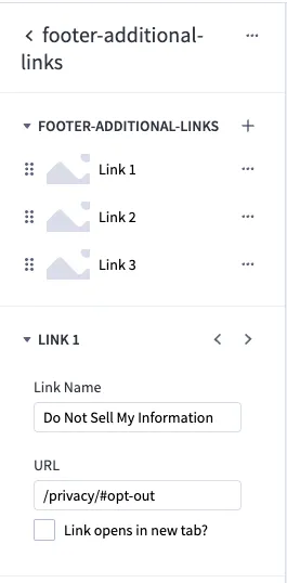
To add more additional links, click on the small plus sign. If you want the link to open in a new tab, please check the “Link opens in a new tab?” box.
Lucid v2
Main Navigation
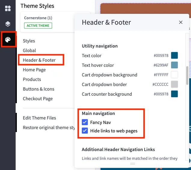
For desktop, there is a toggle in our theme settings for Header & Footer called “Main navigation”. If you want the drop down nav, plaese leave the “Fancy Nav” option checked.
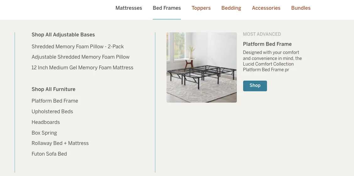
This would be the extra categories and featured products that appear in the category dropdown on hover. See the image below as an example of this feature.
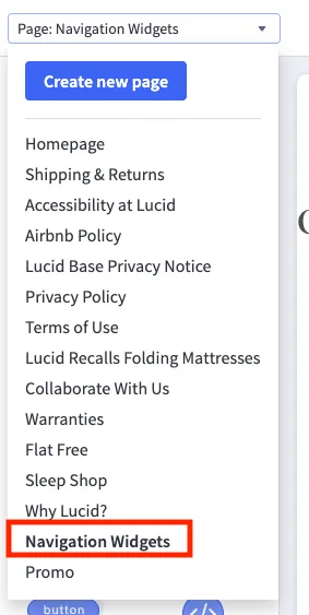
Once activated, you will be able to add three different widgets to the dropdown area: “header-nav-products”, “header-nav-links” and “header-nav-featured_v2”. To add the widgets, please navigate to Navigation Widgets page. We ask that you add them on this page due to the hover features that make it difficult to add new sections.
The Dropdown sections appear in the order they are in the main nav from top to bottom. Each section has two regions devided by a horizontal line. Typically, the “header-nav-links” and “header-nav-products” go on the left and “header-nav-featured_v2” on the right.

For new categories or categories without a dropdown that you would like to add, you will see a empty global region on the Navigation Widgets page. This will be your starting point for all the widget shenanigans.
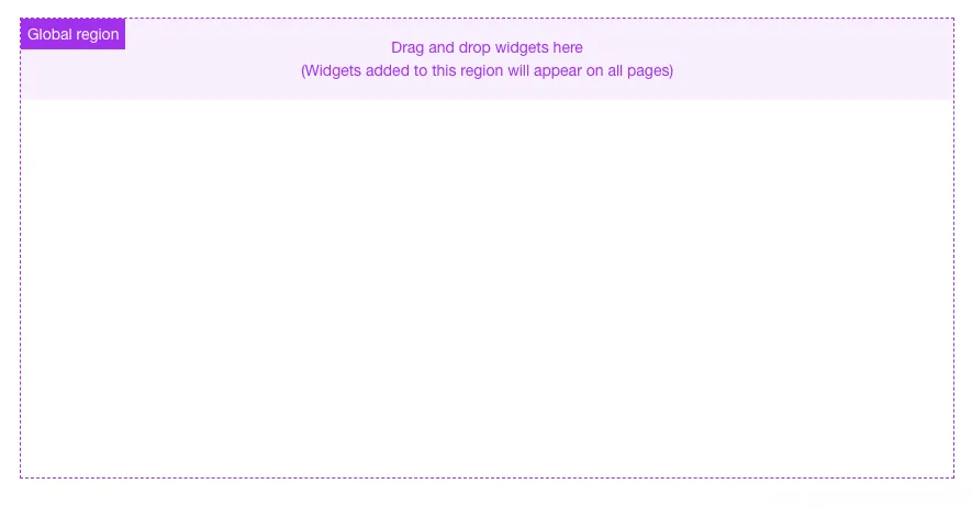
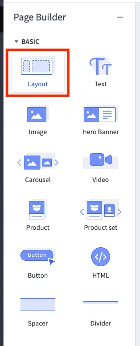
If you want to add multiple widgets to global regions, you’ll first have to add the layout widget; one of Bigcommerce’s default widgets.
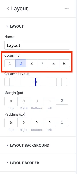
Once the layout widget has been dropped in to the global region. Set one column for each widget you want to add to this region. Then, drag and drop those widgets to columns.
Please only add “header-nav-links_v2” and “header-nav-product” widgets to the left side of the dropdown. Ideally you will only use one of each. On the right side, only one “header-nav-featured_v2” will be used per the design.
If you are unable to get the dropdown to look how you would like, please reach out to the dev team and we can help you achieve the desired layout.
Header-nav-products widget
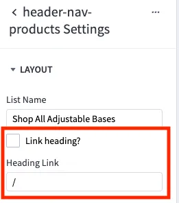
The header-nav-products highlighted above is a new widget for version 2 of the Lucid site. It highlights specific products that, you as the content manger, will set.

To change the title name or list name, simply click the three dots in the upper right corner of the widget and select Settings. There you will find an option to change the list/title name, as well as make the text link to a specific page or category. If you would like the title to be a link, check the box and add the url in the Heading Link input field.
Footer Navigation
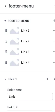
The footer is much easier to update than the header nav. Yay! The footer is composed of four global widgets named for each navigation column. For reference, these widgets are named footer-menu and are reusable.

To update the title and links, simply click into the existing widget and make changes accordingly. The title can be updated in the Settings which is located by clicking on the three dots in the upper right corner of the widget.
Footer-contact-info widget
On the right hand side under the email sign up of the footer, you will see contact information. The contact information is also a widget. To update, simply click into the widget as it exists on the page and update the fields accordingly.

Privacy & Other Footer Links
You will see there are additional links at the bottom of the footer such as Do Not Sell My Information and the California Transparency Statement. These links will appear by the copyright at the bottom and are more intended for extended privacy policy and terms and conditions links.
To update these links or add more, click on the area on the page where the widget is located. The widget name is “footer-additional-links” for reference. To change text color, please click on the three dots in the upper right hand corner and select “Settings”. Adust the color inputs accordingly.
To add more additional links, click on the small plus sign. If you want the link to open in a new tab, please check the “Link opens in a new tab?” box.
Social Media Icons
For the social media icons and links in the footer, we are pulling hard-coded svgs in our system. If you would like a new social icon that is not listed currently, please put in a task and we can get it added for you. However, the social links you can update on your own via Page Builder.
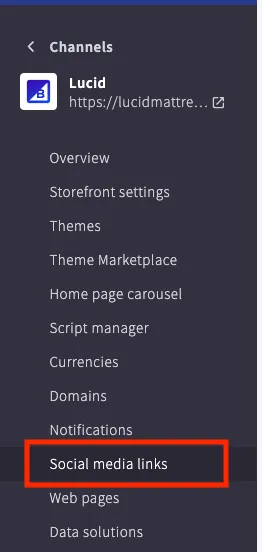
Navigate to the channel for the store and in the left hand column select “Social media links”. Here you can add or update existing links.