Product Page
Here we’ll cover all aspects of the product page. There are 2 main sources for inputing information to be displayed on the product page. The first is in BigCommerce’s product view page, and the second is in BigCommerce’s Page Builder.
Custom Fields
| Name | Value | Description | Multiple? | Template |
|---|---|---|---|---|
| addon | product ID | Adds an upsale item to the product page. Clicking “add” will open a modal with the product options | ✅ | ALL |
| detail= | text | The value entered here will be for the dropdown content in the “Get into the Details Section”. Whatever text comes after “details=” will be what is shown as the title of the dropdown. ex: “detail=Materials & Certifications” will appear as Materials & Certifications | ✅ | Default/Mattress |
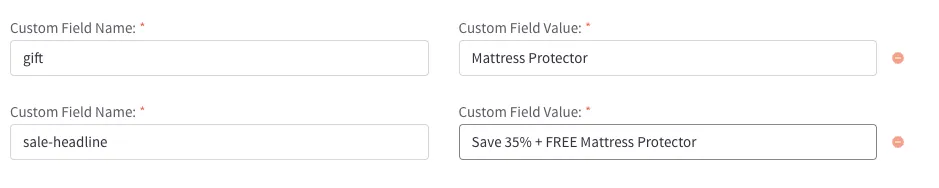
| gift | product name | Note* This is an old component from Lucid v1 and has not been fully styled to match the v2 design. Read more about the custom field | ALL | |
| prop65 | boolean | Enables the Prop65 warning on product pages in the details section. | ALL | |
| sale-message | text | Adds the value as a sale message to the PDP above the price. “sale-title” and “sale-code” are optional. Text styles can be changed in the config. | ALL | |
| sale-title | text | Optional. Adds text preceeding the sale message. ex: Sale Title: Sale Message | ALL | |
| sale-code | sale code | To change the styles of the sale code (or to change any other portion of the text), add the text for the code here. In the “sale-message” custom field value, replace the portion of the text you want to replace with “{code}“. ex: “use code {code} to get 50% off…” would be the “sale-message” value and “BF50” would be the “sale-code” value. | ALL | |
| shipping-message | text | A shipping message to display below the “Add-to-cart” button. The message will be preceeded by the ”In Stock!” message and icon and will hidden if the product is out of stock. ex: Ships in 1-3 Business Days | Default/Mattress | |
| shipping-returns | text | If added, the shipping/returns icon will be displayed followed by the text added. ex: “Free Shipping& Easy Returns” | Default/Mattress | |
| sleep-trial | text | If added, the sleep-trial icon will be displayed followed by the text added. It will also be displayed in the details section on Backlisted tempates. ex: “100-NightSleep Trial” | ALL | |
| subhead | text | Text to be added below the product name. Currently, the only product to use this is the ‘Eco Sheet Set’. ex: ‘with TENCEL™ Lyocell Fibers’ | Default/Mattress | |
| tag | text | Same as the product card custom field. The text entered will be shown inside a tag below the products name. ex: ‘Best Seller’ | ✅ | Default/Mattress |
| update-description | option name | This is to be used for updating the “In a nutshell” region of the page. The value entered must match exactly how the option is spelled in BigCommerce. To be used with the ‘description=’ custom field. ex: ‘Feel’ | Mattress | |
| description= | text | To be used with the ‘update-description’ custom field. The value entered after description= in the name field should match up with one of the variants of the chosen option. The text entered in to the value will then be displayed when that variant is selected on the PDP. ex: ‘description=Plush’ ‘Some text description…’. (Limit 255 characters) | ✅ | Mattress |
| variant-tracking | [option name]=text | Adds a new line to the product details section that will track the variant selected of the option. The text entered after the option name will be used as the title for that detail row. ex: ‘Feel=What’s the Feel? | ✅ | Default/Mattress |
| detail | X=Y | Display extra information about the product in the details section | ✅ | BackListed |
| feature | text | adds a bullet point to the feature tab. Removing all will remove the tab. | ✅ | BackListed |
| warranty | text | ONLY FOR BACKLISTED. Adds warranty text to the warranty icon and detials section. | BackListed | |
| daily-steal | [title]=text | Displays a sale promotion banner below the product tag and before the product description. The text entered after the title will be used as the offer text. ex: ‘Fall Sale!=25% Off Everything’ | Default/Mattress |
Product Pricing
3 tiered pricing! Follow BigCommerce’s docs for general usage. The only thing really worthy of documenting here is the sale badge. It will be displayed with a percentage difference between the sale price and the normal price (or the MSRP if added) and will be updated automagically🪄 between variants.
Product View
The product view page in Pagebuilder gives us access to a lot of product information. This section will be used to explain how to display information on the product page that isn’t standard to BigCommerce. For all standard display information, please refer back to the BigCommerce documentation.
Variants
When setting up a products variants, BigCommerce gives you a few options to choose from for how they are displayed. Given the current styles in use on Lucid, only swatch and rectangle box are prepared for use. Unless directed, do not use the other variant display options.
Description & Features
deprecated/backlisted
The description tab will show whatever is inputed into the description textboxt. Any HTML or elements added with the WYSIWYG editor will display. This includes lists, quotes, images, and more. Even changing the color of text works. Learn more about the WYSIWYG editor here.
Features will be added into a list under the features tab. The tab will not display if there are no features set. To add a feature, use the custom field feature with the value containing the content to be displayed in the list.
Product at a Glance
Dimensions/Depth - This will list all of the variant height and width. To add these values, In the product view page under Variations → Variants, select Edit columns ▾ and check ✅ width (Inches) and ✅ height (Inches). The depth used will be the depth assigned to the main product.
Warranty
The warranty field can now support new lines 🎉. Only one return is needed between paragraphs. The first line of the warranty field will be peeled off and used elsewhere and should be reserved for the warranty length (ie: “10 Year Warranty”).
The disclosure that is displayed after the main Warranty text can be edited in the language file as it is universal between all products.
Templates
There are now 3 templates to choose from: Mattress, BackListed, and the default template. Mattress and the default are very similar with Mattress having a few extra widget regions and global components. Backlisted is just a stripped down version of the default and uses a lot of old custom field settings and slightly updated Lucid v1 components.
Page Builder
An easy way to bring these pages up in Page Builder would be to go in BigCommerce’s main naviagtion to Products → View → then navigate to the item you want to edit in the list. Open the options up for this product by selecting the three dots ··· on the right side of the product in the list. From this menu, select View in Page Builder.
In this view, you’ll see regions denoted by a colored box that you can drag our custom widgets into. These regions are named and can also be seen in the Layers tab on the left side of Page Builder.
Don’t Forget, you can access extra settings in almost every widget by selecting the three dots ··· next to the widget name and choosing settings. If you can’t find a specific setting in a widget, it may be inside this section.
FAQ
The FAQ widget an array based widget and should be added next to the ”contact us” section. The widget will give you access to two inputs for each FAQ, a question and an answer. The Answer input is an HTML input, allowing lists, links, and more. Make sure to hit Save HTML below the content input or what you’ve entered will not display and will be removed if you switch sections.
Promotions
To turn on a free product promotion in tandem with the promotions builder, you will need to use the gift custom fields on the product.
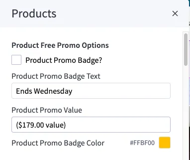
For the promotion badge, please enter Page Builder > Theme Settings > Products.
Within the Products section at the top, you will find “Product Free Promo Options”. If you want the badge to show, simply check the box next to “Product Promo Badge?” and adjust the others settings as needed.
Featured Cards
featured-cards : Array Type
⚙️ Settings: True
Feature callout cards with an icon, title, and text content inside of a carousel
The array inputs are fairly basic. Similar to the other icon selection inputs, selecting Custom from the icons list will give you an input for the custom icon’s name. This will match any icon stored in WebDav at /content/icons/. Learn more about WebDav
The hidden settings can get a little more advanced:
- You can reverse content flow of the card with the icon at the bottom, text content on top.
- Color settings allow changing the container background color (set to transparent by default to share the background on the product page), card background color, title and content text color, as well as UI primary and secondary colors used for the carousel arrows/dots (primary color set to white by default, as will appear over the shared background) and the selected dot (secondary color).
- Alignment and icon size are set in the mobile, tablet (>= 768px), and desktop (>= 1440px) view settings.
As with other carousel widgets, you must save changes to preview the carousel.
Mattress Unboxing
mattress-unboxing-v2
v2 version of the previous unboxing video (
mattress-unboxing)
It is fairly simple with just a heading and a video, requiring an embed URL from YouTube (i.e. https://www.youtube.com/embed/3RfwrkFFmss).
Note: the video should ideally be 16:9 aspect ratio as is YouTube’s default. However, at the tablet (>= 768px) size, the video shows in 3:2 aspect ratio frame, resulting in a black border above and below the video. If you use any other aspect ratio than 16:9, there will be a black border at the mobile and desktop screen sizes as well.
Layered Images Section
layered-images-section
A section that is split between a “layered” or “stacked” image and a block of content including a heading with an icon
This widget starts with a vertical split and then switches to a horizontal split at desktop screen size (>= 1440px).
Note the following important settings:
- Image : A single image. If design calls for two images stacked or otherwise configured, export group as single PNG image with transparent background.
- Icon File Name : Custom icon name and file extension (i.e.
sunburst.svg) matching any icon stored in WebDav at/content/icons/. Learn more about WebDav - Reverse Section Flow : Allows you to reverse content flow with the image on the bottom/right, content on the top/left.
- Mobile, Tablet, & Desktop Views : Allow you to change the heading and content alignment at each screen breakpoint and also adjust the icon position as needed.
Level Up Comfort
level-up-comfort : Array Type
⚙️ Settings: True
A section that is split between an primary image and a block of content consisting of a secondary image and a list of features
This widget starts with a vertical split and then switches to a horizontal split at desktop screen size (>= 1440px). The simple array inputs are the numbered list items that are to correspond to numbers in the primary and secondary images. The text is split into a bold part that appears first followed by the normal unstylized part.
Note important hidden settings:
- Italicized Heading : First part of the heading
- Normal Heading : Second unstylized part
- Swap Heading : Swap the italicized and normal parts of the heading
- Primary Image : A single image with the numbers exported as part of the image. As the numbers can appear quite small on mobile, there are two image uploads for mobile and >= 551px screen sizes.
- Secondary Image : A single image with the numbers exported as part of the image
- Reverse Split Section : Allows you to reverse content flow with the primary image on the bottom/left, content on the top/right.
Mattress Inside
mattress-inside-v2 : Array Type
⚙️ Settings: True
A section that is split between an animation (video) of spreading mattress layers and a block of content consisting of information about each layer.
This widget starts with a vertical split and then switches to a horizontal split at desktop screen size (>= 1440px).
The hidden settings include a section heading and the animation source, which will need to be a video uploaded to Cloudflare. A Customer ID and Video ID for the respective video are required (request or send task to web dev team).
The array inputs consist of each mattres layer Name, Content, and position of a button over the animation that displays the content when activated. You will need to enter a percentage from the Top and Right of the animation for each button, checking its position between mobile and tablet screen sizes as the animation scales. Very little adjustment from the right is needed.