Homepage Setup
The homepage for Malouf Home is a combination of widgets and components. Most are pretty straight forward, but the few of the more involved widgets/components are described below. Please submit a ticket or reach out the Web department if you would like more detailed instructions.
Hero (Home Module Widget)
The home module widget is used at the top of the home page and the showrooms page. Though it may look a little complicated, you simply leave the inputs blank that you do not wish to display on the page. Such as subheading or button link.
The widget settings have now been organized into categories; Content, Container Settings, Text Settings, Button Settings, Background Image, and Custom Styling:
- Content
- Contains inputs pertaining to the content of the widget (heading text, button links, etc.).
- Leaving subheading, button text, or addditional text blank will remove their resective elements from the page.
- Inline HTML tags can be added to the Heading, Subheading, and Additional Text inputs.
- Container Settings
- Controlls the settings for the text box. Most of these inputs apply only if “Text Container background on desktop?” is checked.
- Text Settings
- Text Colors.
- Button Settings
- Button Colors.
- Background Image
- Only one image need be uploaded at the maximum size (~1920px width). The widget will then pull smaller versions of the image and display them as needed.
- A max height can be set for mobile and tablet views to prevent the image from growing to tall and taking up the entire screen.
- Custom Styling
- Here you can add custom css to the widget for things that aren’t covered by the widget settings. Unless you are comfortable with css, it would be recommended asking the Devs for help.
Top Seller Carousel
The top seller carousel is a component and will default to pull the top sellers for the site. If you wish for this to be updated to a different feed, please reach out to the web team.
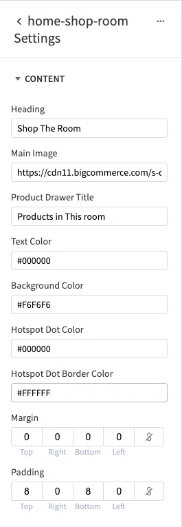
Shop The Room
The shop the room section on the homepage is a widget. You can add values and hotspots through page builder. The same values will be used on mobile, so you will only need to input data once.
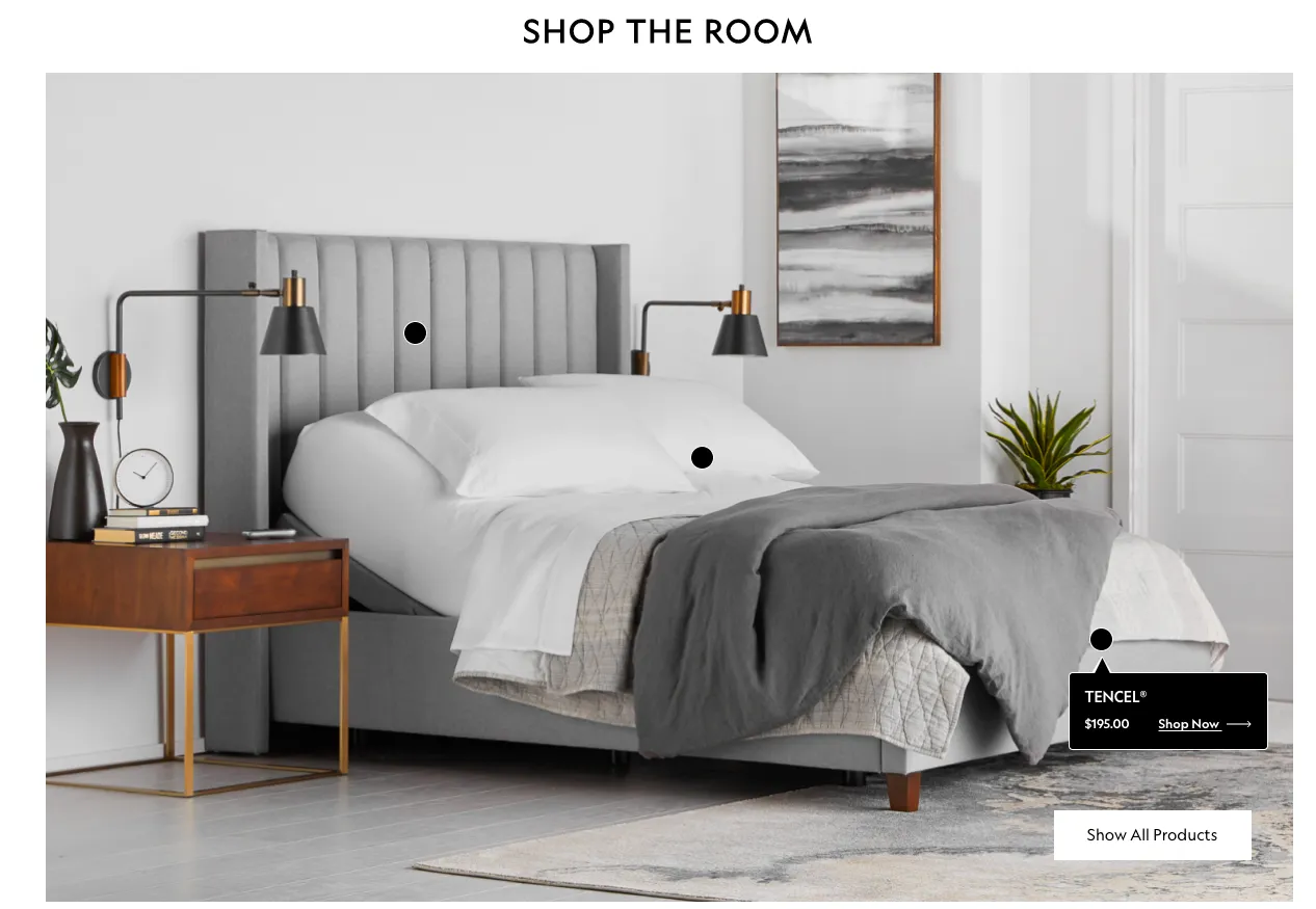
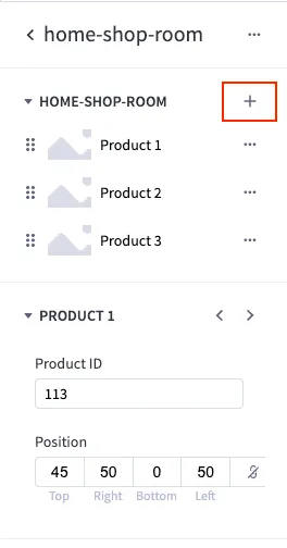
Use the “Position” input to move the hotspot around on the main image. All the product data will be pulled from the product name. Simply select the product you wish to feature.
To add more hotspots and products, simply click the little plus sign near the top of the widget.
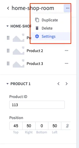
To change or update the main image and other values, click on the widget “Settings”. This will take you to additional inputs.
The settings view will look something like this: